Common design mistakes is more common than you think, that’s why we’ve written 9 common mistakes to help you avoid them for a fabulous décor.
1: Rooms That Are Overly Coordinated
“A room that is too carefully coordinated, with all new or store bought pieces, is very uninspiring. A home is a personal narrative and personality should shine through. In this living room, we used items from travels and small vintage pieces to really bring the space to life.”
2: Choosing Small-Scale Furnishings for Small Spaces
“In small bathrooms, people tend to select petite vanities, which can minimize usability of the space and make it appear smaller. This bathroom had a small footprint, so we used a monochrome colour palette and created a custom floating vanity that extended into the shower space for maximum impact. For small rooms especially, a well-designed custom solution can make the space appear larger and function better.”
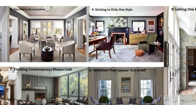
3: Too Many Accessories
“A common design mistake we often see is over-accessorizing, especially in rooms that have multiple uses. You have to know when to stop. Every room needs a space that allows the eye to rest. We kept the soft furnishings in this room simple and selected pieces that had personality, but did not steal attention away from the owners’ fantastic collection of art and collectables.”
4: Sticking to Only One Style
“One common mistake is assuming that the style of your home should dictate your decor. A traditional home does not necessarily mean your design details must be traditional and vice versa. We love to mix it up and combine transitional or contemporary pieces alongside traditional or antique styles. In this home office, an old beautiful desk and beat-up leather chair worked perfectly with a new steel and brass console and contemporary lounge chair.”
5: Improperly Hanging Artwork
“A common mistake is to think artwork must line up with the top of a door frame or the panelling. In this room, we had tall wainscoting on the wall as well as a wonderful but immense canvas that we knew would be perfect in the space. Our solution was to centre the painting on the wall over the wainscoting, between the floor and the bottom of the ceiling moulding. It is symmetrical to the room and just perfect that way.”
6: Lighting Fixtures That Are Too Small
“One design mistake that I see quite often is the use of a chandelier that is under-scaled or too small for the space. It’s necessary to consider the size of the room as well as the ceiling architecture when selecting a fixture. A vaulted or high ceiling, like the space above, will call for an even larger chandelier. I usually err on the side of selecting a fixture that runs the risk of being too large rather than too small.”
7: Thinking Contemporary Means Cold

“Designing a contemporary home does not mean that the look has to be stark and uninviting. Texture on the walls, windows and floors and well-placed accessories and collected pieces add soul and personality to this contemporary living room and make it welcoming and warm.”
8: Windows That Appear Too Small
“Sometimes the design of the home’s exterior architecture results in the windows appearing too short in the interior. To elongate the windows, we employ a trick of the trade with the window treatments. We install the drapery hardware at the maximum height with a roman shade an inch below. This makes the windows appear much larger than they actually are.”
9: Letting One Element Dominate
“The one huge design flaw in this house was its two-story stone wall. While the stonework itself was really well done, the wall was overbearing and way overboard. To make it work, we added a second floor and created two new rooms, one kitchen dining area (see above) and one home office, that both showcase and frame the original stone wall.
